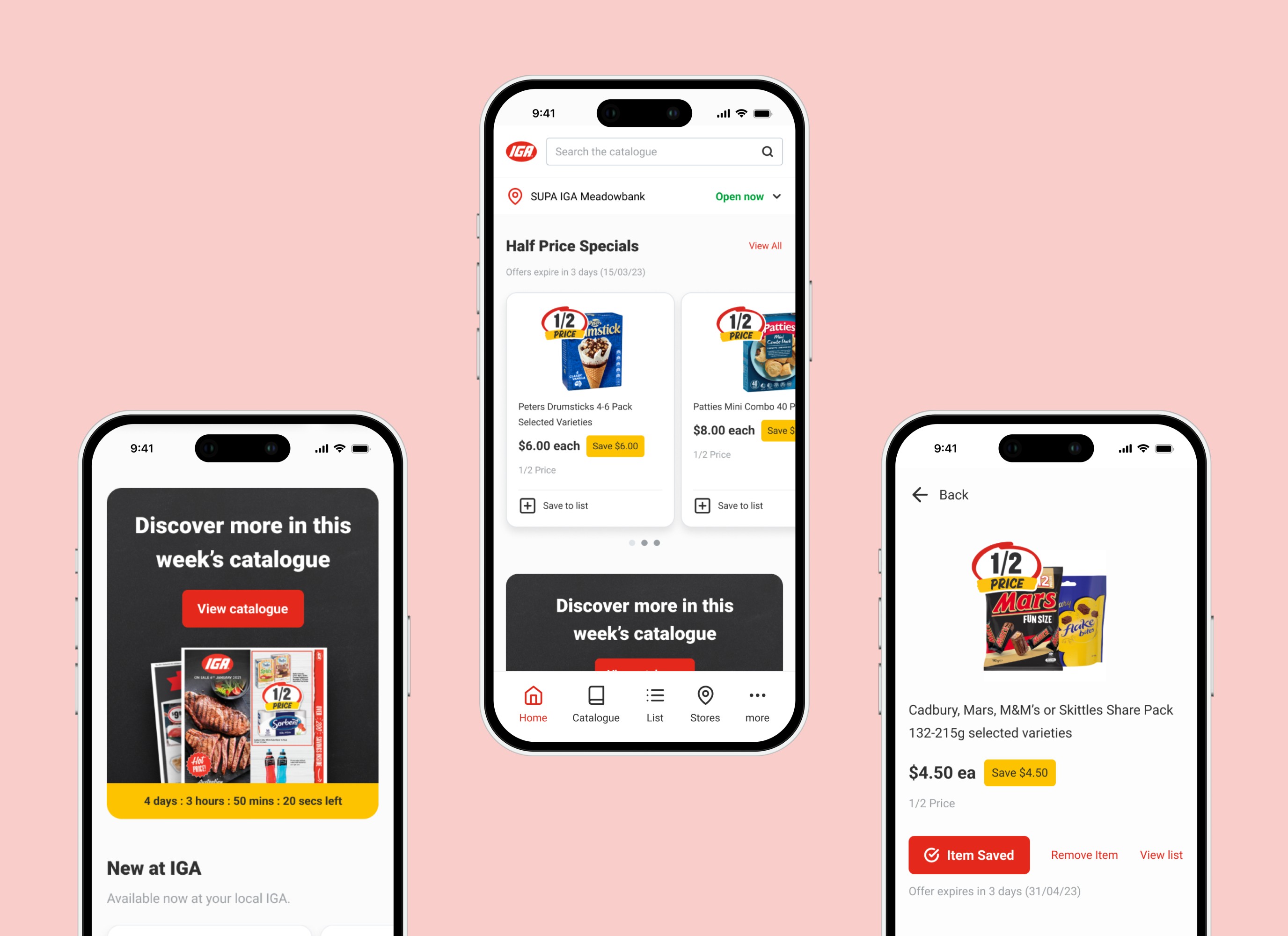
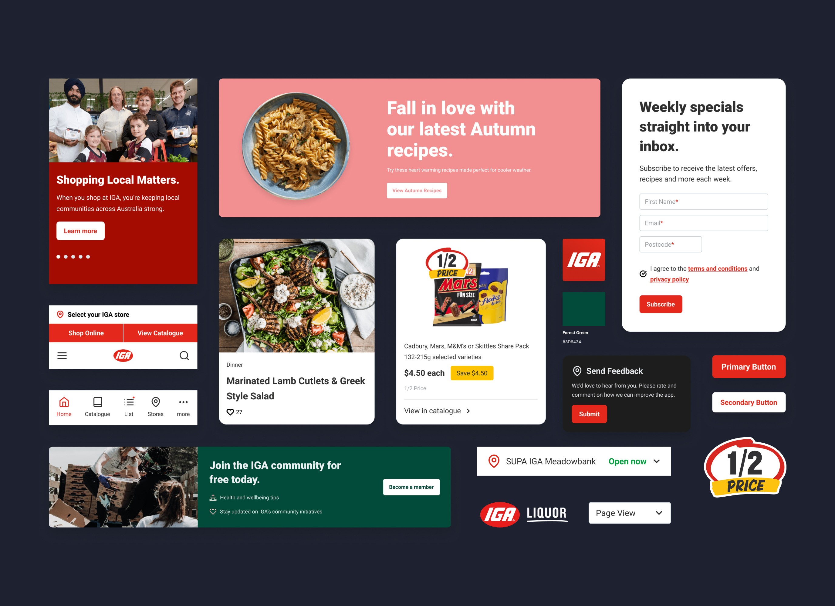
As part of an ongoing project aimed at continuously improving the user experience of the IGA website, I collaborated with the digital marketing manager and technical development lead to plan and prioritise key projects for the year. Specifically, this project focused on optimising the IGA online catalogue by addressing key usability issues identified in our research and analysing the digital catalogue landscape to understand what was needed to bridge the gap.
role
Lead UI/UX Designer
Impact
• Introduced features that standardise our experience with direct competitors
• Delivered on user flow, navigation and usability fixes
• Uncovered usability insights through quantitative research
Desired Impact
• Improve engagement metrics such as pages per session, bounce rate and returning users
• Increase in usage of features
For research, we determined that we needed to dig a little deeper to better understand our users motivations, needs, and pain points.
To help guide our UX optimisation decisions, we conducted usability research via surveys integrated into the IGA website as a pop-up.
We synthesised the data to identify the following key insights:
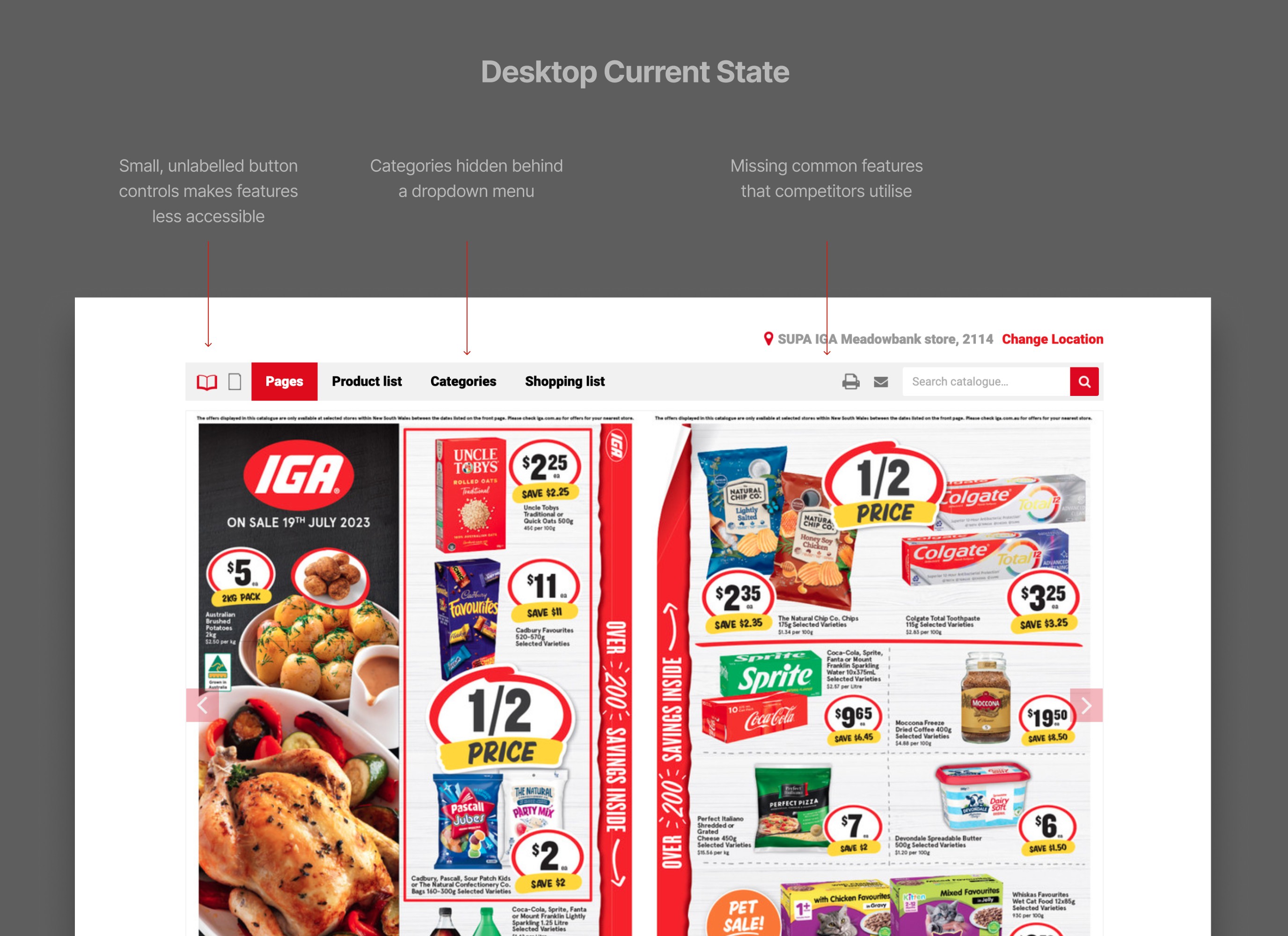
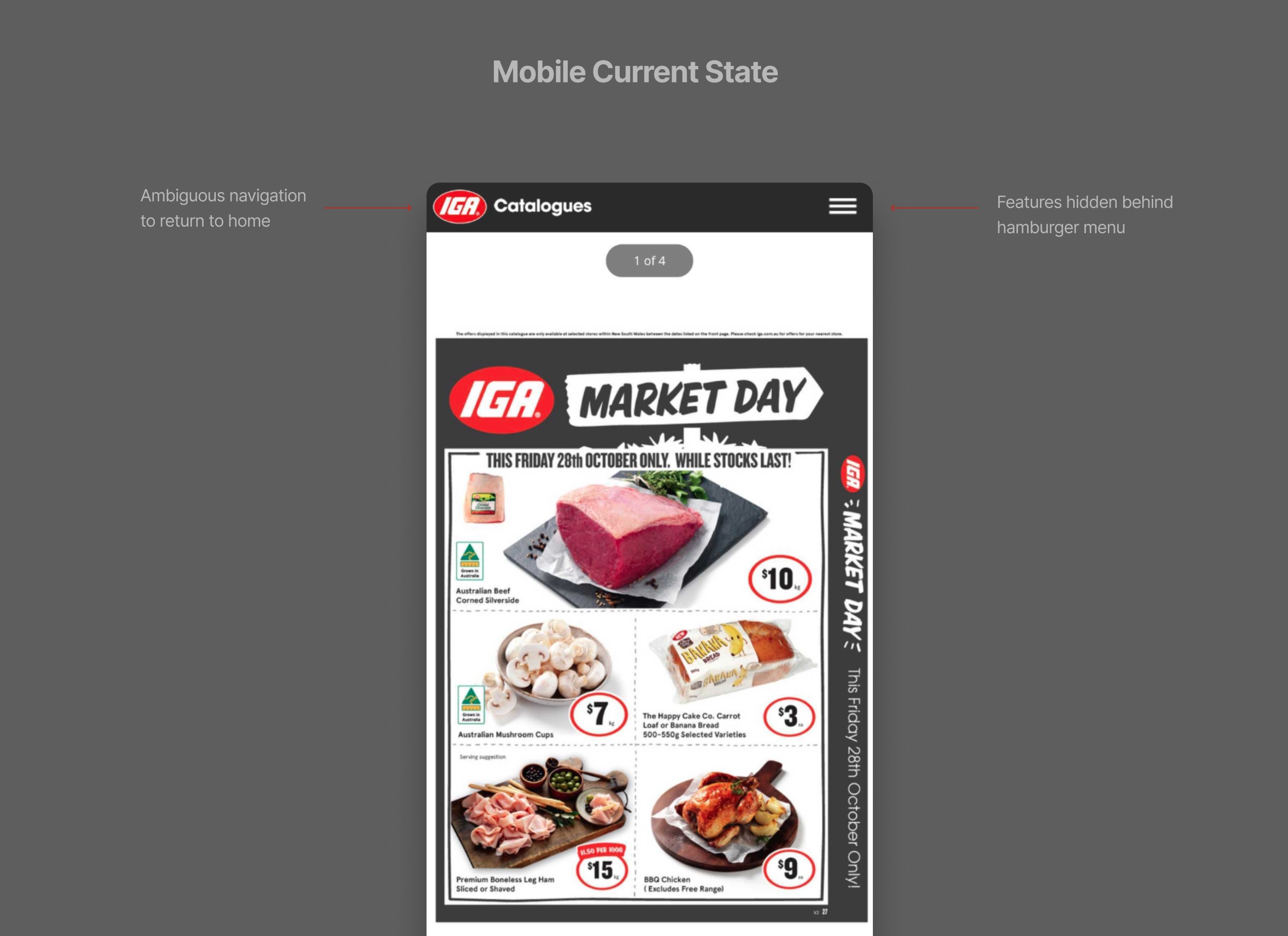
Poorly designed UI of navigation and features – Especially on mobile where users are missing features that are hidden behind the hamburger menu and bounce rate is higher due to ambiguous return to home navigation
Feature requests – Users requesting common features they have come to expect from our competitors' digital catalogue
Browsing Issues – Some are experiencing usability issues, such as pages being cut off on certain screen sizes and devices
The digital catalogue has not been updated or optimised since its inception and the way that it has been designed is causing frustration in our users.
For the IGA shopper, the current experience lacks interaction and visual cues, making existing features less accessible. Some existing features are also hidden behind a menu, and there are usability issues such as pages being cut off. All of these factors make browsing the catalogue and finding products difficult and frustrating.
For the business, our digital catalogue is outdated and lacks common features that users have come to expect when compared to our competitors who’ve since made improvements to their catalogue experience, and as a result have gained a significant edge over ours.
Design goals
In order to provide a seamless catalogue experience across both mobile and desktop devices, we needed to design an experience that fits within each specific environment. We then broke the solution down into 3 key areas:
• Redesign the catalogue UI specific to desktop and mobile issues by improving navigation and usability
• Implement new features that users have to come to expect in an online catalogue experience
• Conduct testing to ensure browsing issues are fixed on popular screen sizes
During the ideation phase, we explored a few ideas based on available digital catalogue solutions, as well leveraging navigation principals from resources such as Google’s Material Design.
There was also a desire from the business to potentially explore more innovative ideas and ways that we can design an experience that gives us a competitive edge in the catalogue space
For desktop, this led to the design of a prototype concept. We demonstrated this concept to the engineering team to assess its viability. The concept aimed to address the iframe browser viewing issues on smaller screen sizes by utilizing a fullscreen viewing mode along with a navigation rail. It also served as an opportunity to create an innovative solution within the supermarket space.
Although the concept was well received by the team, we decided to abandon it after the discussion with the engineers, who helped us uncover several considerations and issues with this particular concept, mainly because of its complexity to build which was not technically feasible and viable at this stage of the project timeline.
The team also took into account other factors, such as the risk that implementing this solution may not provide a familiar catalogue experience for supermarket shoppers. While it may resolve some usability issues and improve the viewing experience, the drastic change to the UI/UX could cause confusion among users. This could require them to relearn an entirely new UI that they are likely not familiar with in this context.
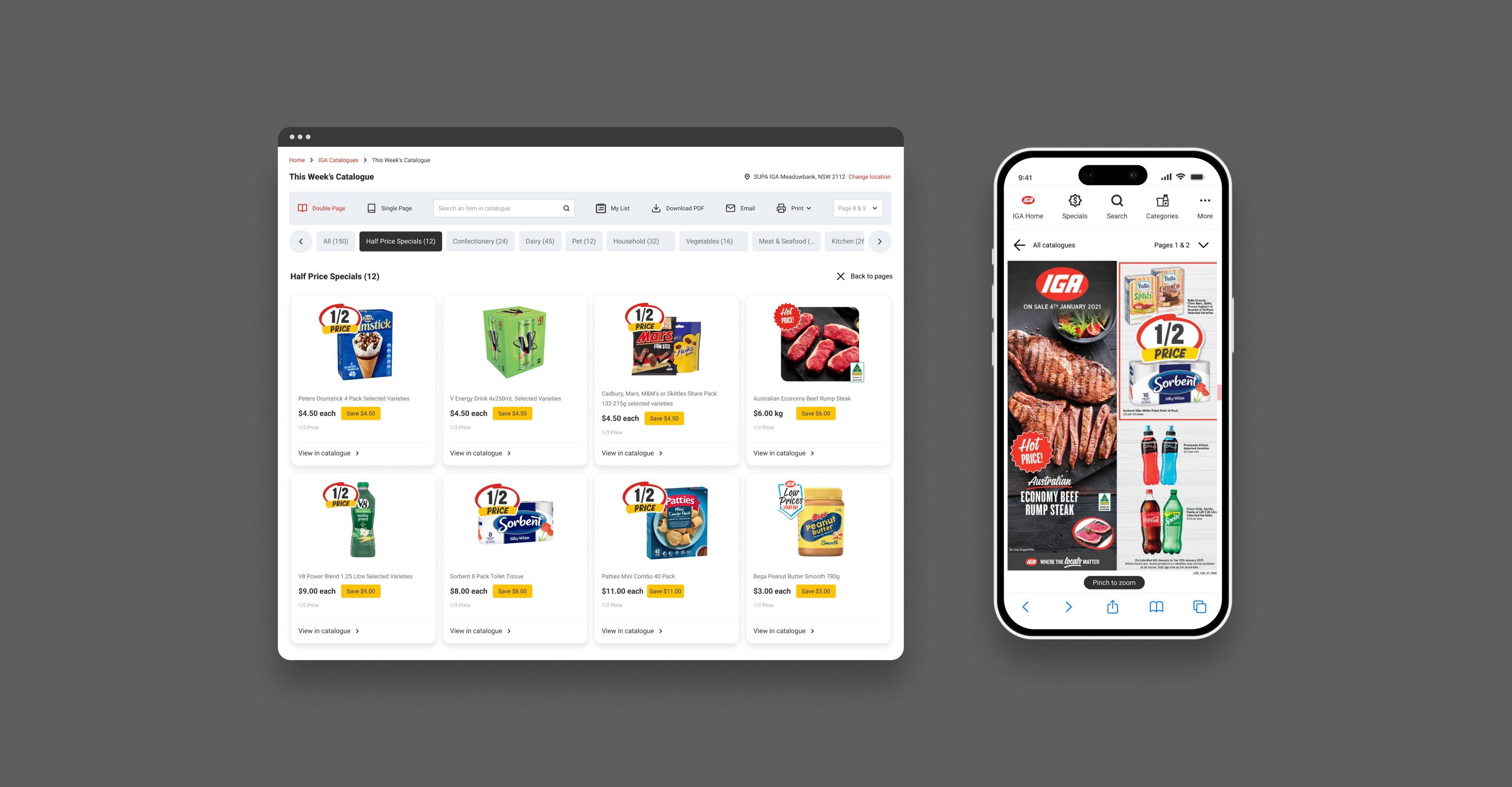
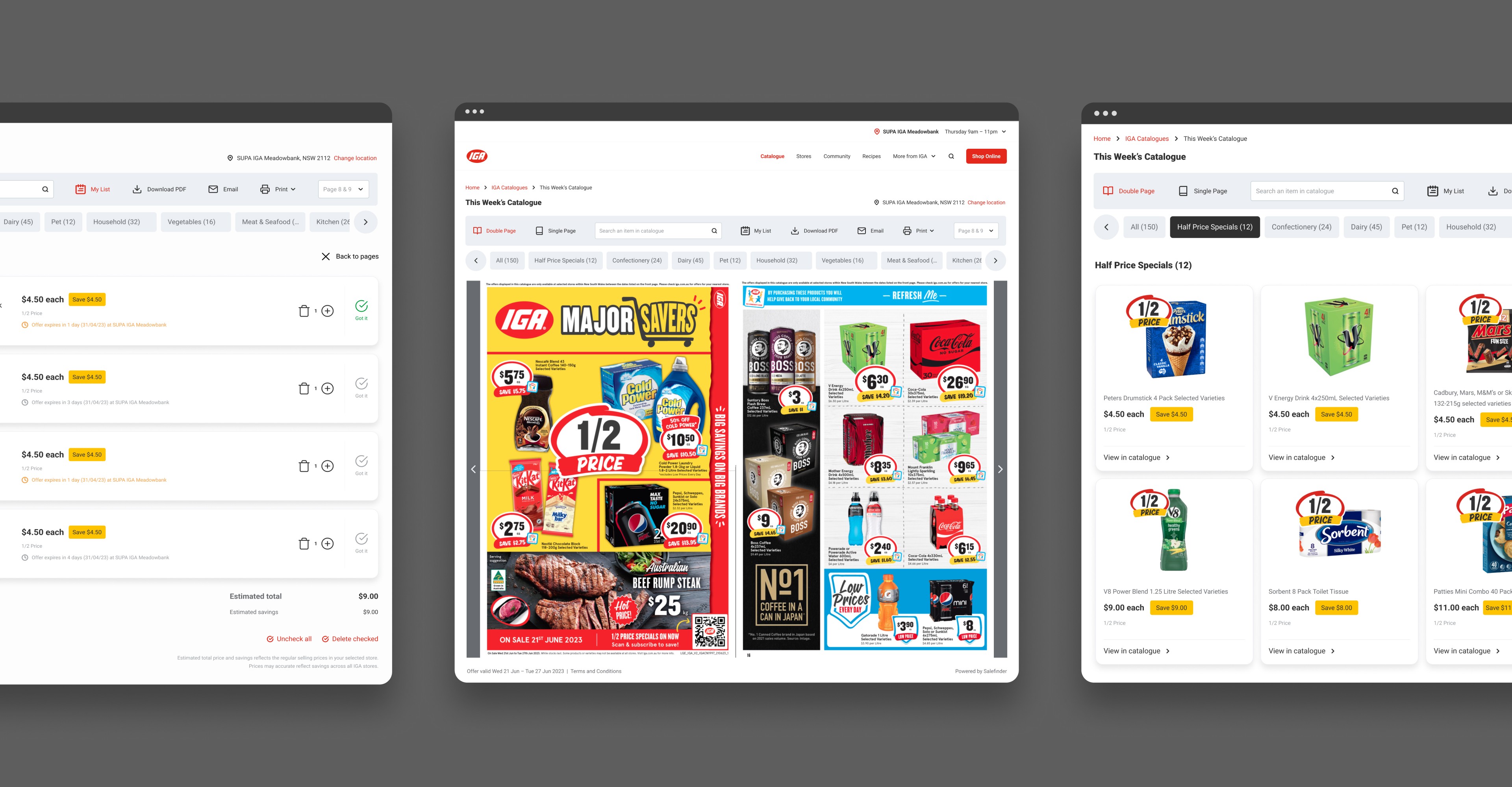
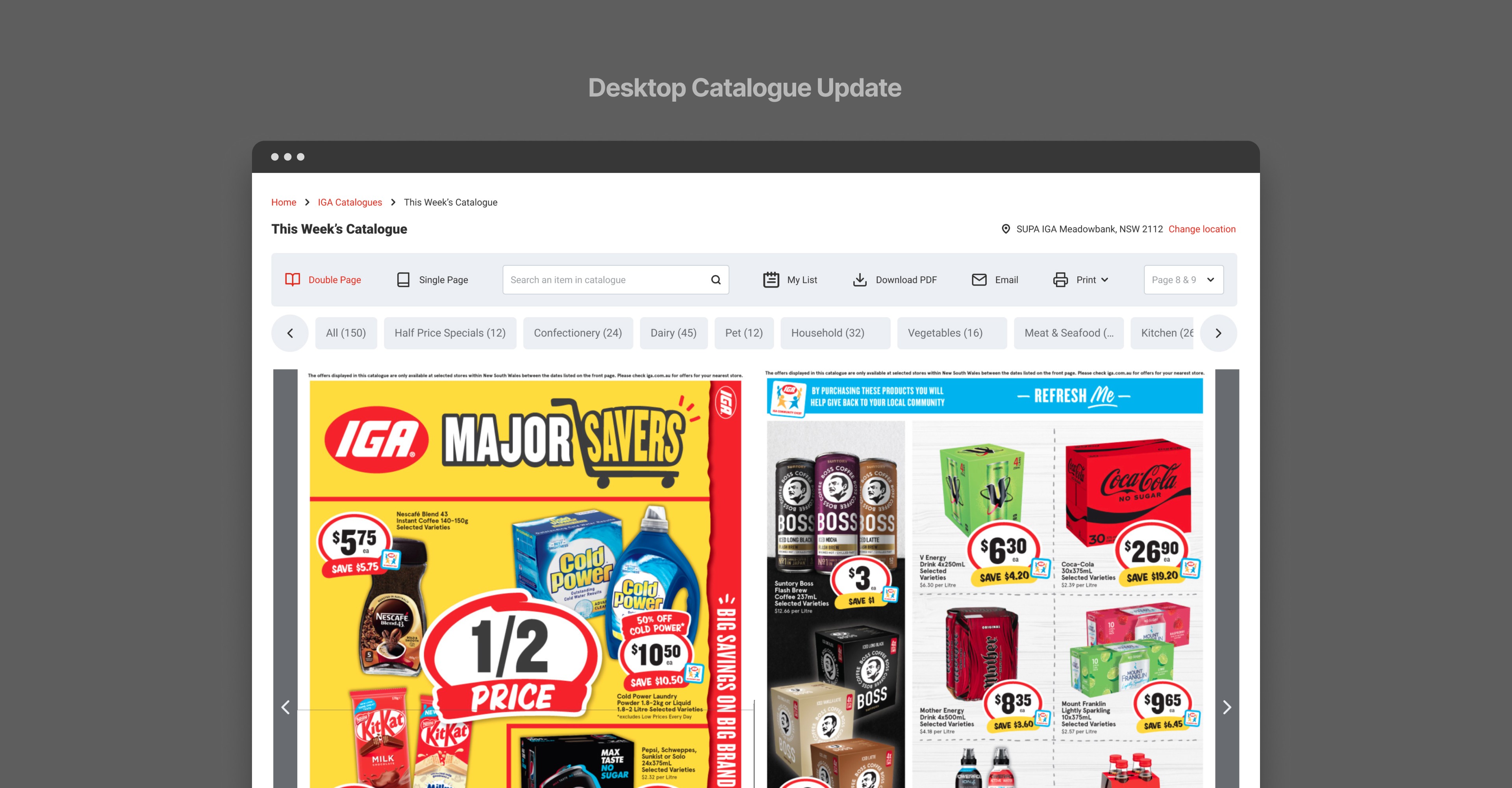
Instead, we took a simplified approach to optimisation. We refreshed the UI by improving navigation controls as well as making new and existing features more accessible. We also updated key screens like product pages, shopping list and categories to improve browsing while still utilising a user interface that people are familiar and comfortable with.
The new UI was designed to ensure that features are clearly labelled with improved interactive visual feedback, as well as an improved ways to navigate and explore the catalogue.
• Active states for improved visual feedback
• Placeholder text search bar and text labels for icons to improve usability
• Dedicated carousel for categories
• New navigation features such as pagination
The updated navigation helps to elevate the IGA digital catalogue experience, making it more competitive product against its direct competitors.
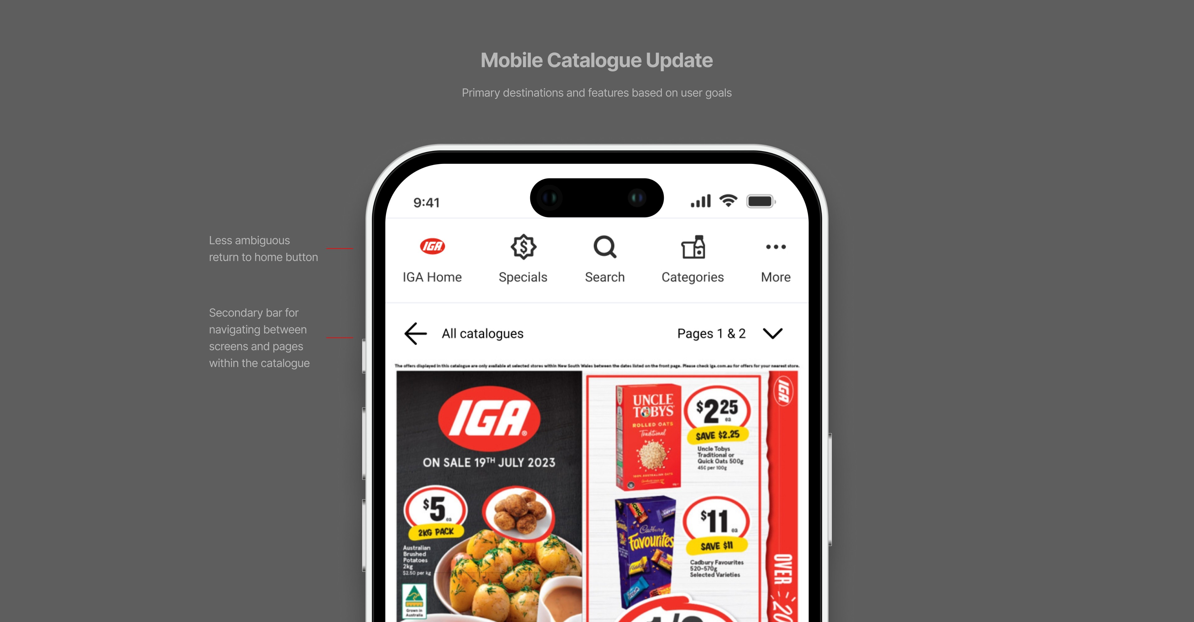
An improved mobile navigation experience
To improve the mobile experience, we needed to address the core issue that stemmed from having an ambiguous navigation and features that were hidden within a hamburger menu.
Due to the nature of the catalogue API which works by overtaking the entire UI, we had to design an entirely new navigation dedicated to the digital catalogue with simpler interactions in comparison to desktop.
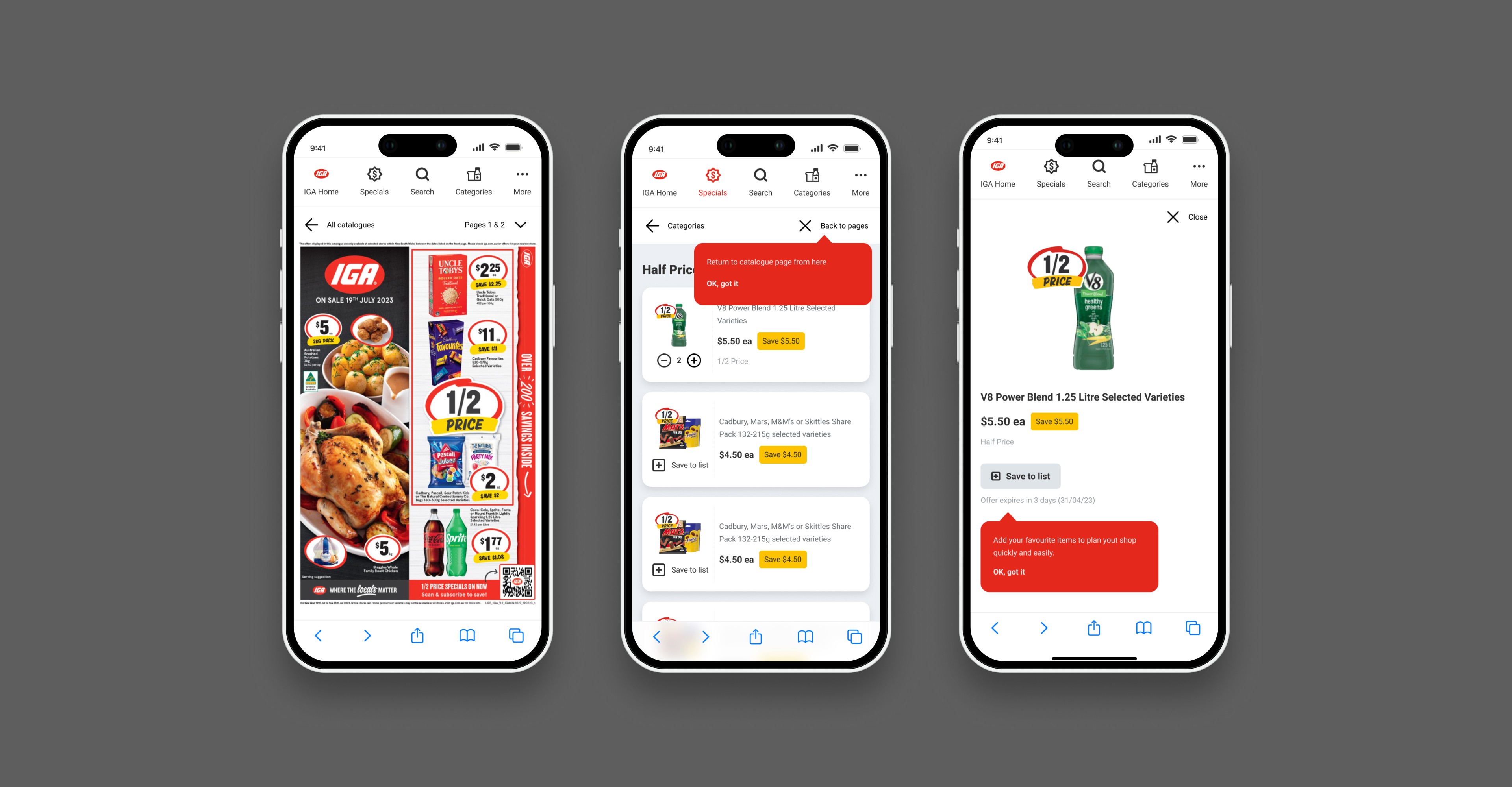
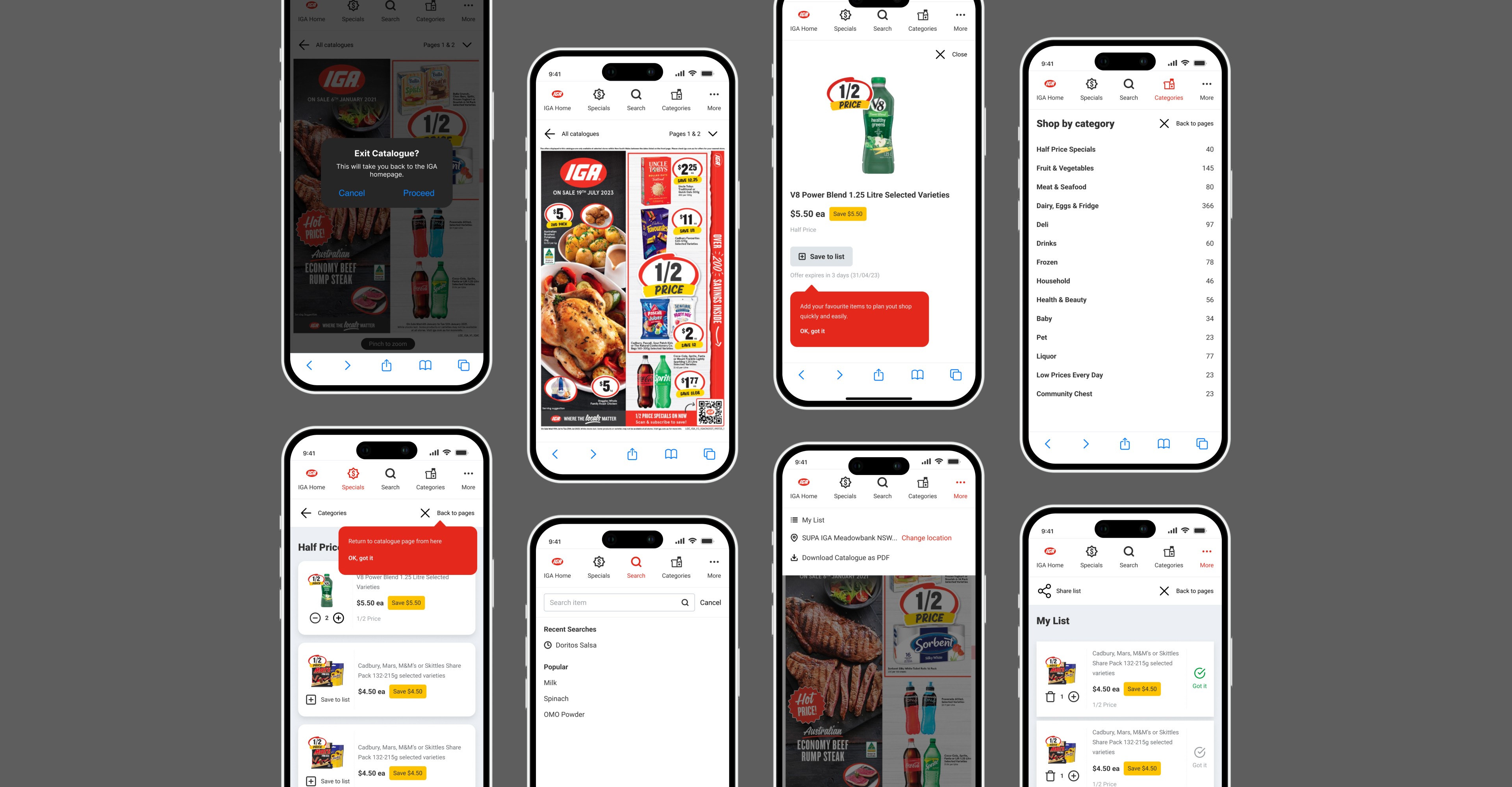
Our refreshed design involves removing the hamburger menu and utilising a top navigation bar to house primary screens and features based on our users needs.
We also implemented other optimisation features such as tooltips throughout the catalogue and native browser functionalities, such as confirmation dialogs, to assist new and existing users in building new mental models of the updated UI more effectively and reducing friction.
Challenges and outcomes
Overall, the project had received sign-off and was well received by the business before my time at Metcash ended. It was a valuable learning experience. However, we could have made better decisions during the concept phase by considering technical feasibility earlier in the design process. Unfortunately, we focused too much on delivering an innovative solution to improve our market position and neglected to review the solution's viability from a technical resource and budget perspective. Doing so would have provided more clarity in our approach to the design.
• Introduced features that standardise our experience with direct competitors
• Delivered on solutions to improve user flow, navigation and usability fixes
• Uncovered usability insights through quantitative research
