Home / Work / IGA Mobile App Update

A product designed to help IGA shoppers discover, plan and save.

A product designed to help IGA shoppers discover, plan and save.

A product designed to help IGA shoppers discover, plan and save.

As part of the business's long-term strategy to enhance their digital experiences and work towards building an e-commerce platform in the future for IGA shoppers, I worked with the digital marketing manager to update the outdated IGA Mobile app. The main objective was to improve overall engagement by enhancing its usability and utility for users, with the vision for the product to become an essential tool for IGA shoppers throughout their journey.

role

UI/UX/Product Design

Impact

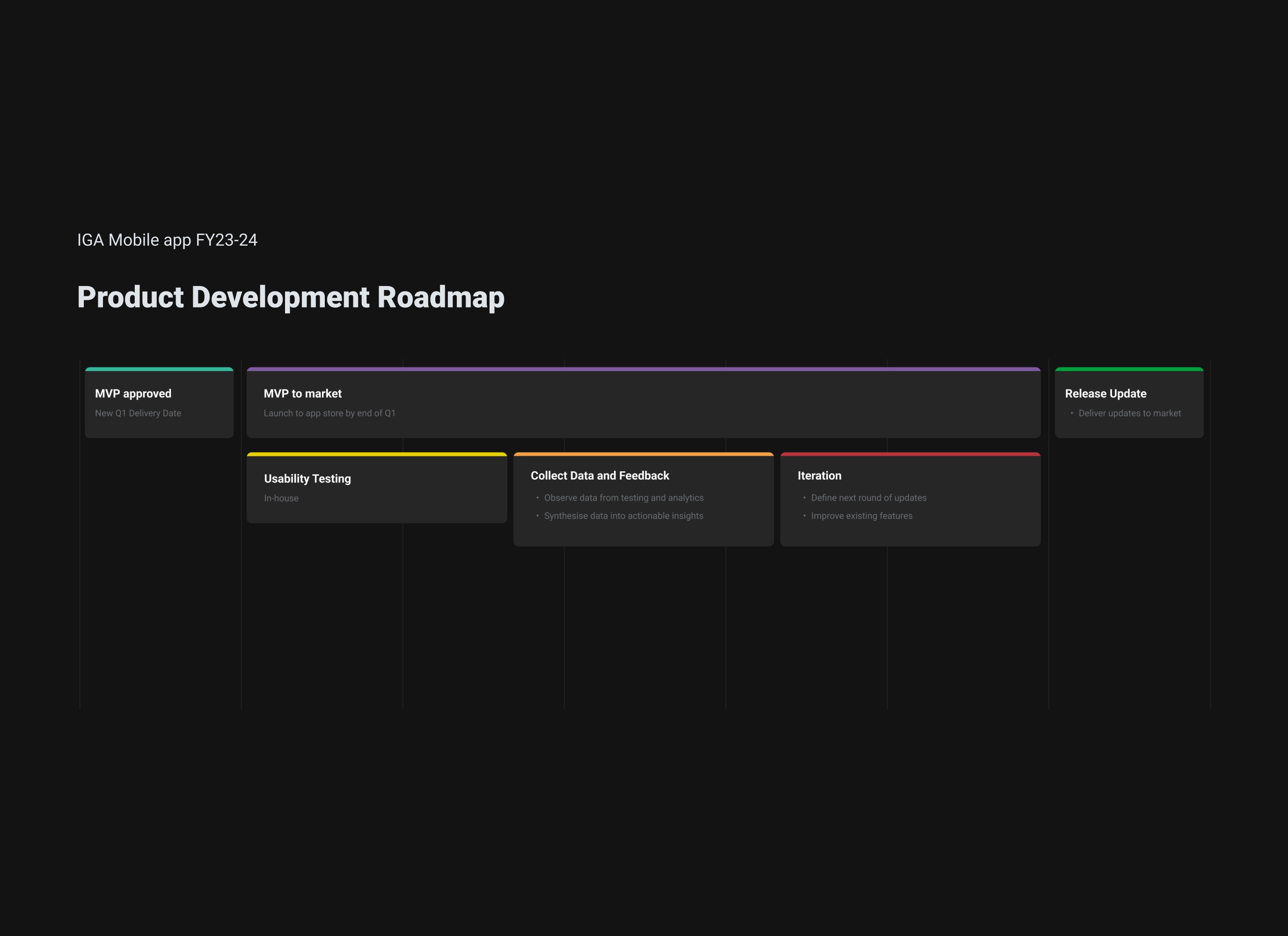
ā€¢ Established a roadmap for further product development

ā€¢ Provided metrics for measuring success

ā€¢ Positive reception from business

Desired Impact

ā€¢ Increase user retention and adoption rates

ā€¢ Uplift in engagement through improved discoverability of products on homescreen and adoption of new features

role

UI/UX/Product Design

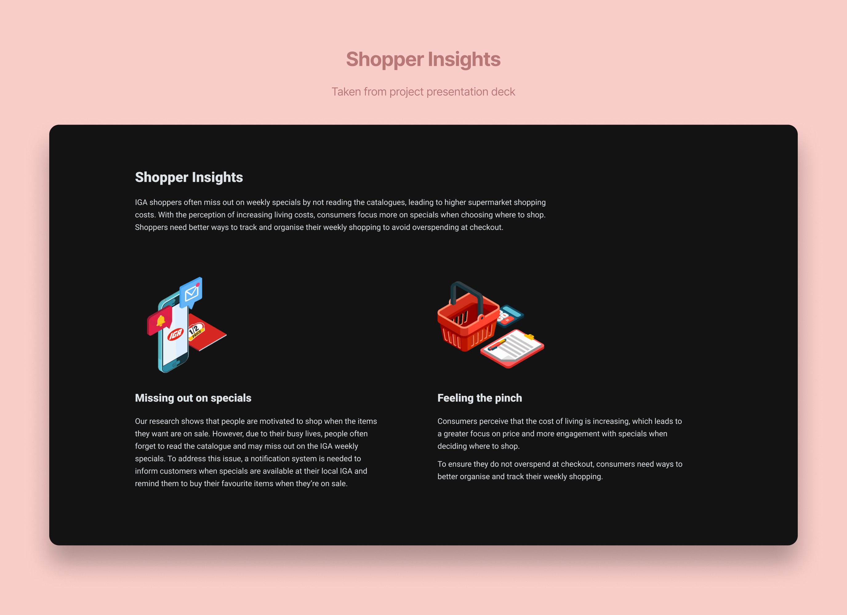
Due to tight deadlines and budget constraints, conducting usability research to uncover insights was not viable in this scenario. Instead, we opted to use the existing analytics we had available as well as relevant shopper insights that was uncovered from previous projects to identify pain points that we can leverage as the key problems to solve for our users.

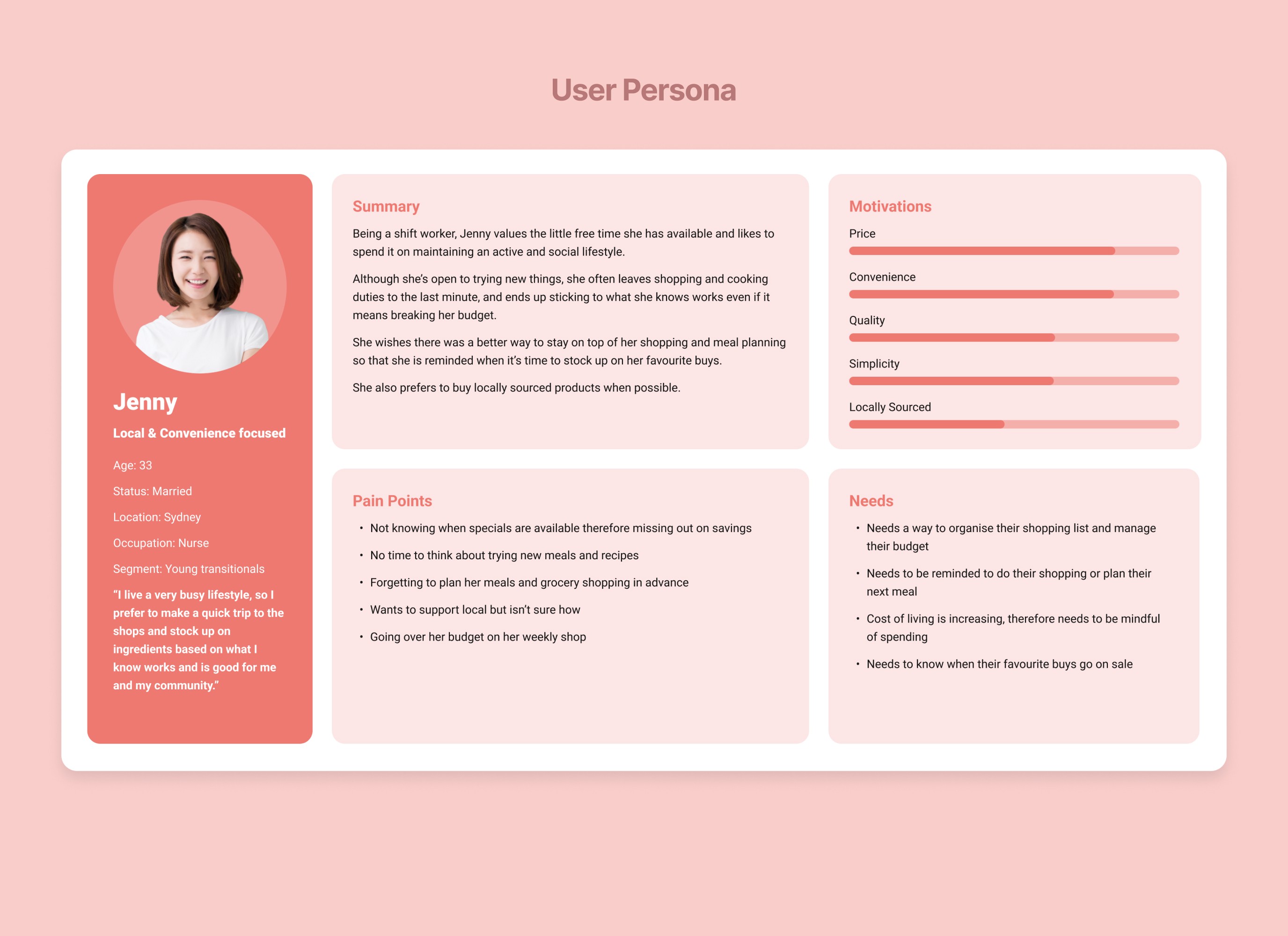
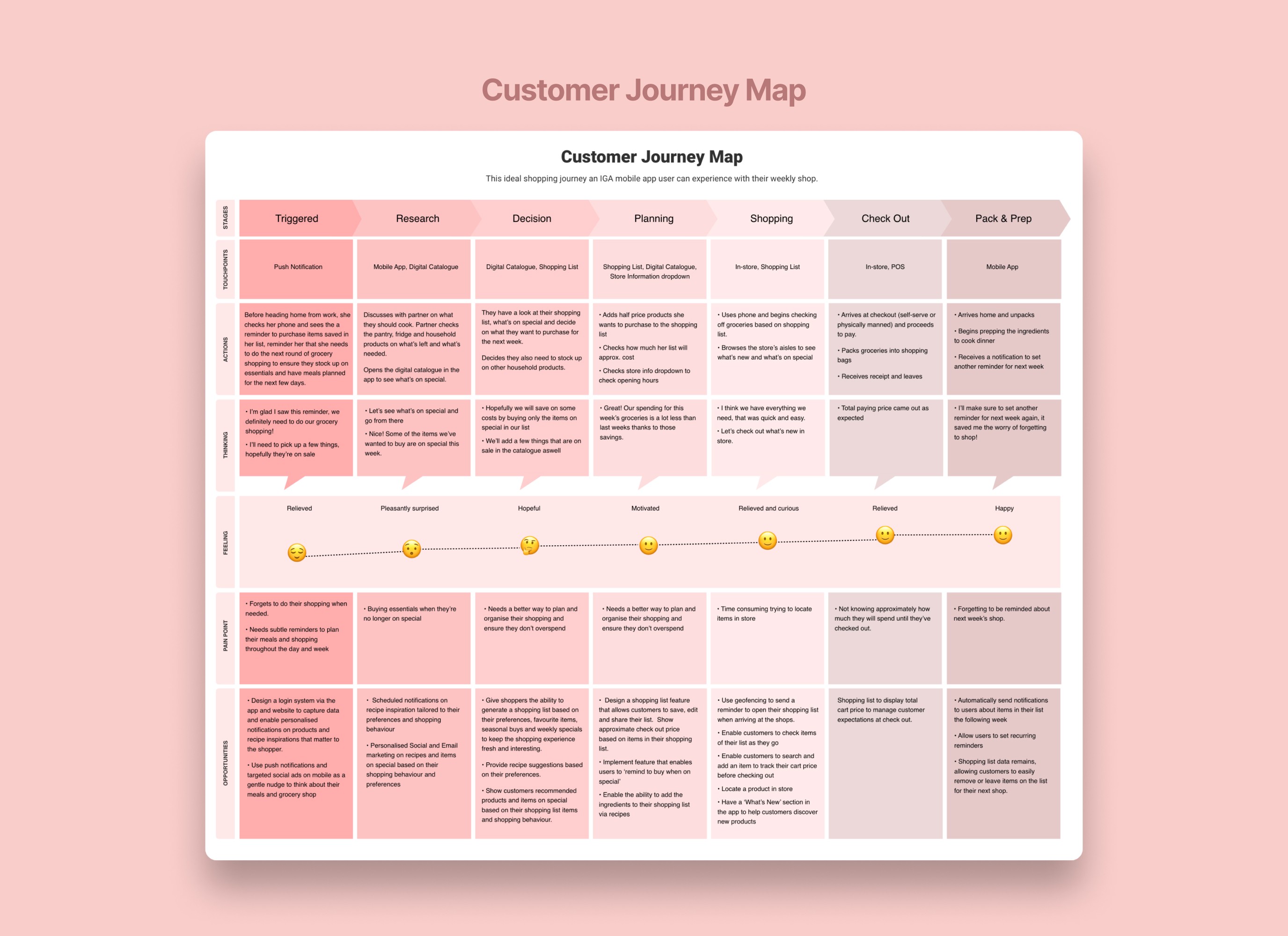
With the available data we had on our users, we created a persona and outlined the ideal customer journey to gain further empathy and to help us identify areas of opportunity we wanted to focus on solving.

Defining the problem

Due to tight deadlines and budget constraints, conducting usability research to uncover insights was not viable in this scenario. Instead, we opted to use the existing analytics we had available as well as relevant shopper insights that was uncovered from previous projects to identify pain points that we can leverage as the key problems to solve for our users.

Using the available insights we had on our users, we created a persona and outlined the ideal customer journey to gain further empathy and to help us identify areas of opportunity we wanted to focus on solving.

Defining the problem

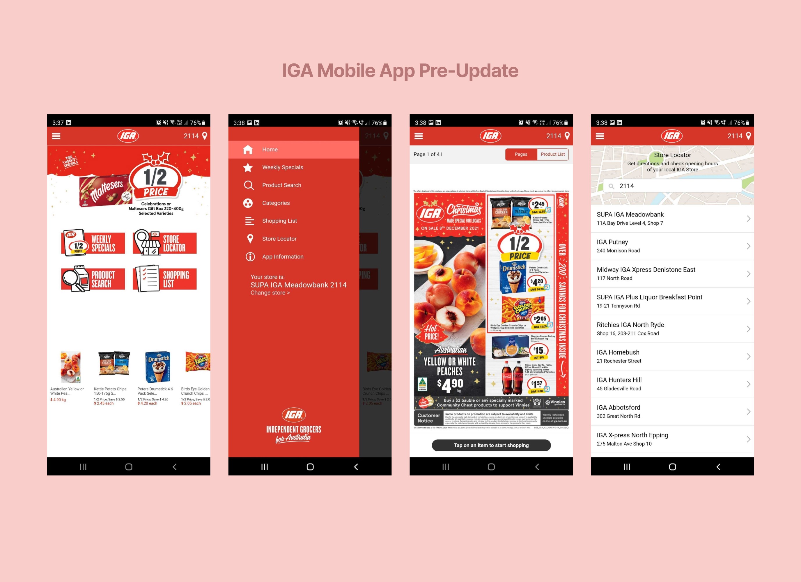
Current state

Current state

After conducting a usability audit on the current state of the app, analysing the competitive landscape, as well as considering our shoppers' pain points and business objectives, we identified key areas for improvement and feature gaps. This information helped us determine how to approach the updated design, with a focus on making the IGA app a more usable and competitive product within the supermarket industry.

Areas of improvement

ā€¢ Outdated, clunky UI doesnā€™t utilise common design patterns for features such as search and navigation

ā€¢ Lack of interaction cues, feedback and tooltips increases chance of user errors

ā€¢ Limited content and functionality doesn't provide enough reasons for users to stay engaged for long

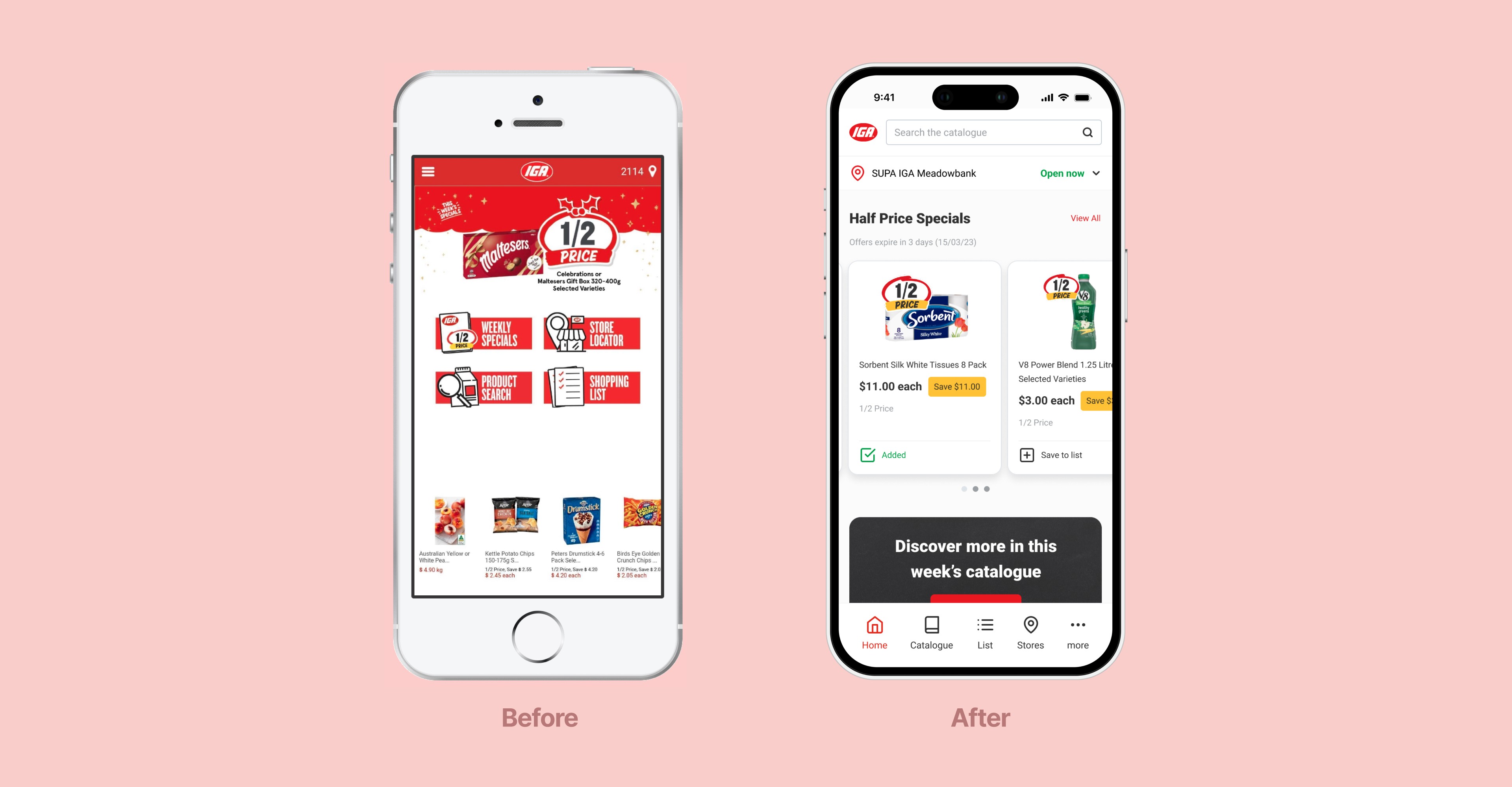
ā€¢ Basic homepage design has poor depth of content making specials less discoverable

ā€¢ Outdated, clunky UI doesnā€™t utilise common UI patterns such as search bar and product cards

ā€¢ Lack of interaction cues, feedback and tooltips increases chance of user errors

ā€¢ Limited content and functionality doesn't provide enough reasons for users to stay engaged for long

ā€¢ Basic homepage design has poor depth of content making specials less discoverable

The Problem

The Problem

The current IGA mobile app is not up-to-date and is poorly designed. It lacks desirable features, which has resulted in low engagement and adoption rates. This puts us at a disadvantage compared to our competitors, whose apps offer more valuable features and better user interfaces that help their users shop more effectively.

The IGA shopper needs a better way to discover specials and be reminded to do their weekly grocery shopping during promotional periods, because currently they are stressed about the increased costs of living and find it difficult to keep track of when specials are available, which can cause them to miss out on savings.

How might we redesign the IGA mobile app to be a more useful product helping them make better informed decisions and reminding them to do their weekly shop when specials are available in order to save on costs?

Prioritising MVP features

Prioritising MVP features

We then engaged in discussions with the engineering team to work together in prioritising the MVP features using our user stories.

Based on various factors such as the businessā€™ desired delivery time to market, resource and technical constraints, we were able to prioritise the build and design of most features, which meant separating the nice-to-have from the must-have and building an MVP.

Design goals

ā€¢ Make shoppers work less to discover weekly specials and promotions with improved depth of content on the home screen

ā€¢ Ensure common interface patterns such as search and navigation are more accessible with an improved design

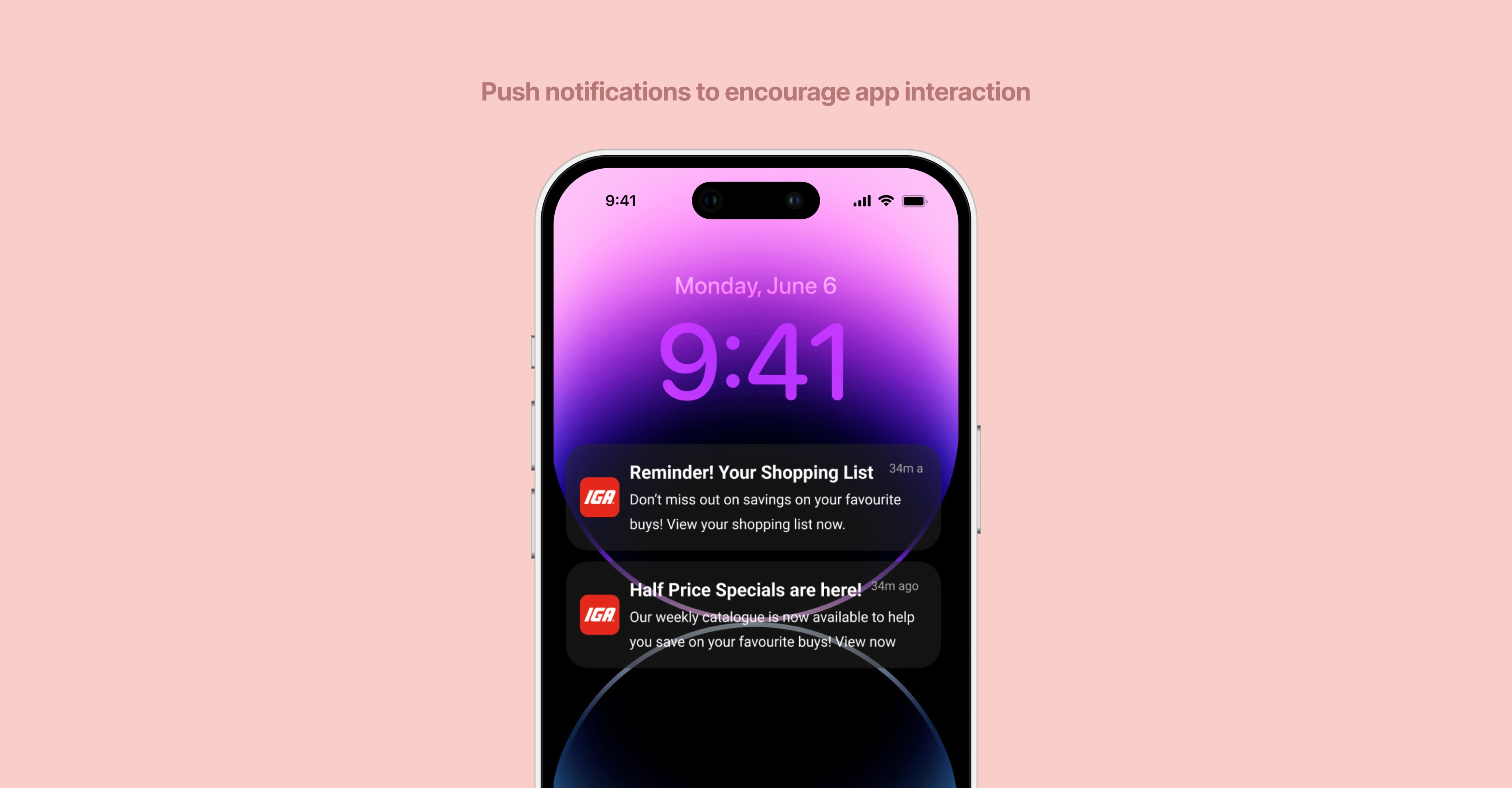
ā€¢ Prioritise features that encourage users to interact with the app to browse, plan and manage their shop such as push notifications and setting reminders

ā€¢ Improve usability with a new navigation, interaction cues, tooltips and an onboarding experience to manage learnability and reduce friction

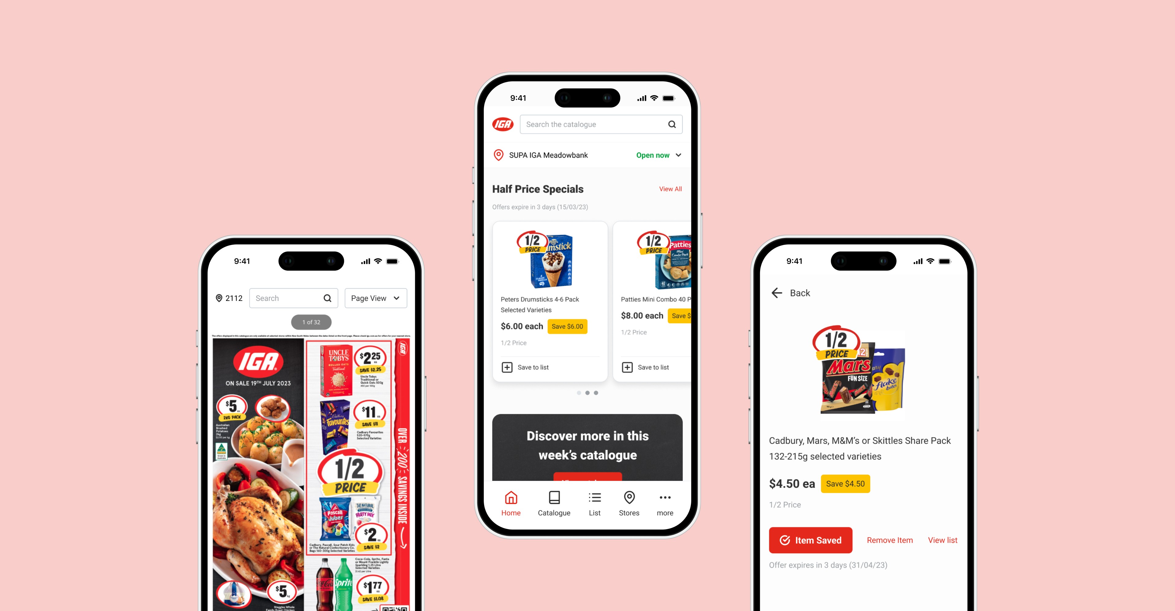
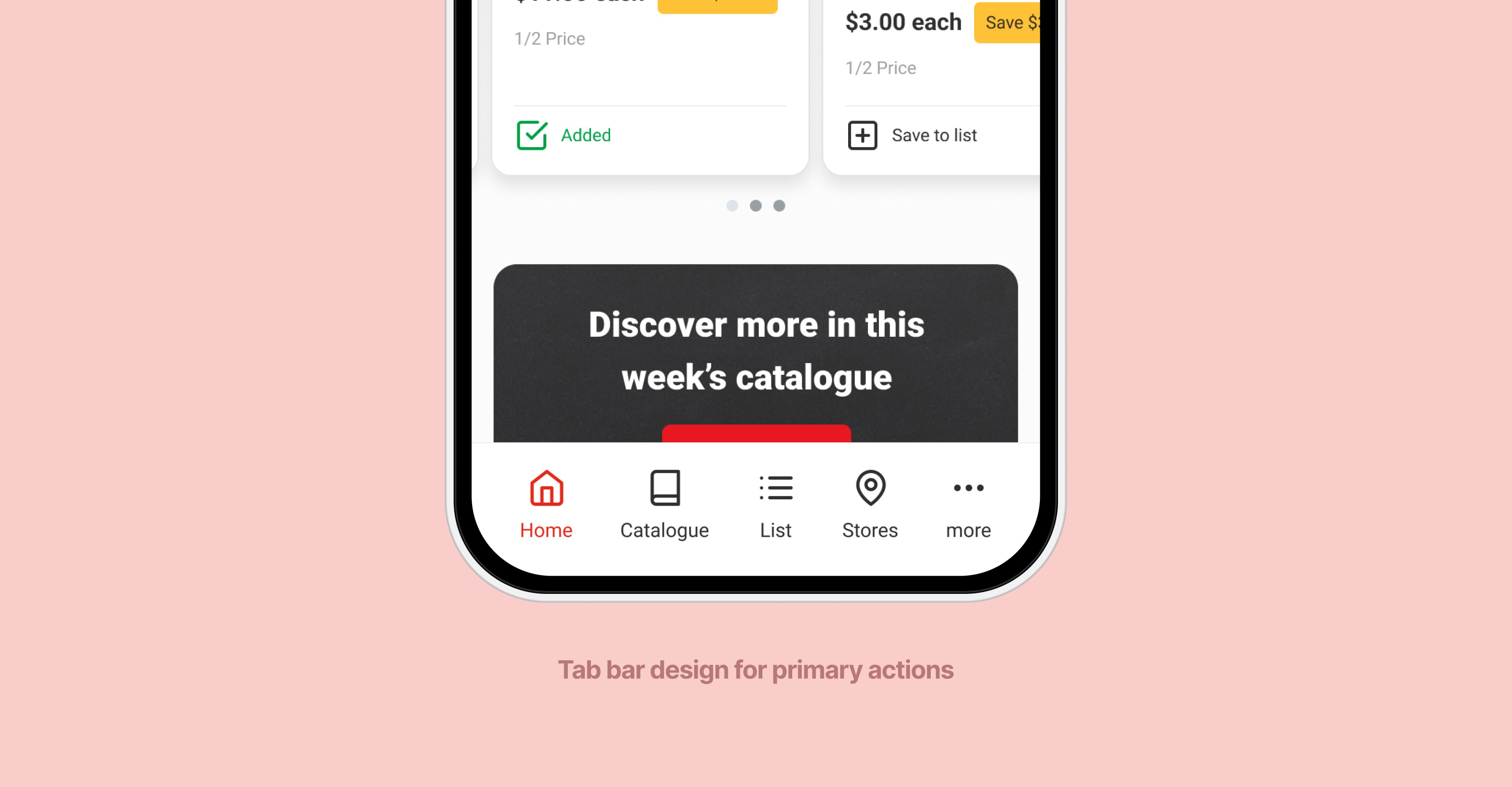
A key design element we introduced based on our analysis of the competitive landscape, and leveraging Apple's Interface Guidelines and Google's Material Design navigation principles is the bottom tab/nav bar to help users easily navigate between primary destinations and actions within the app.

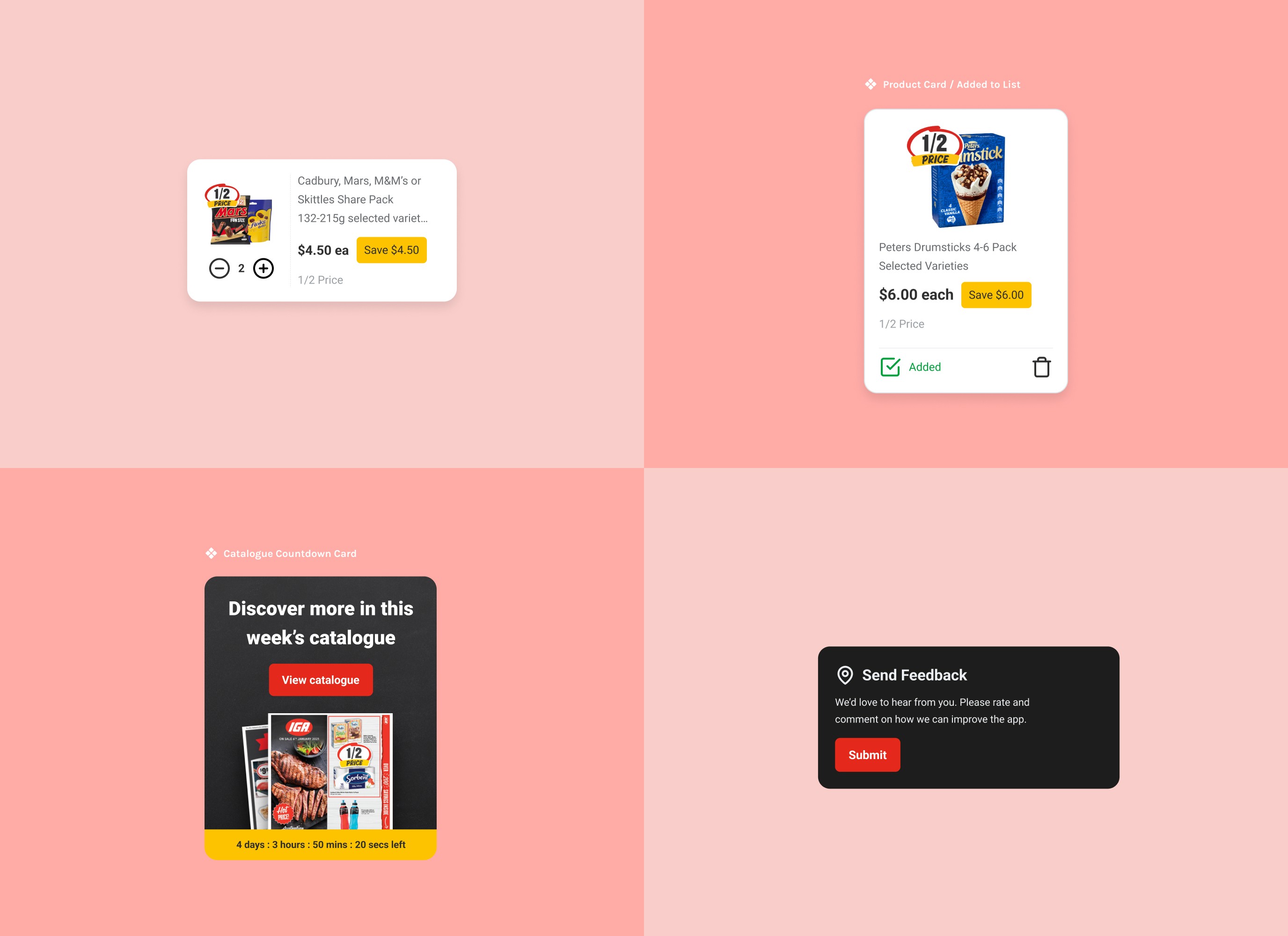
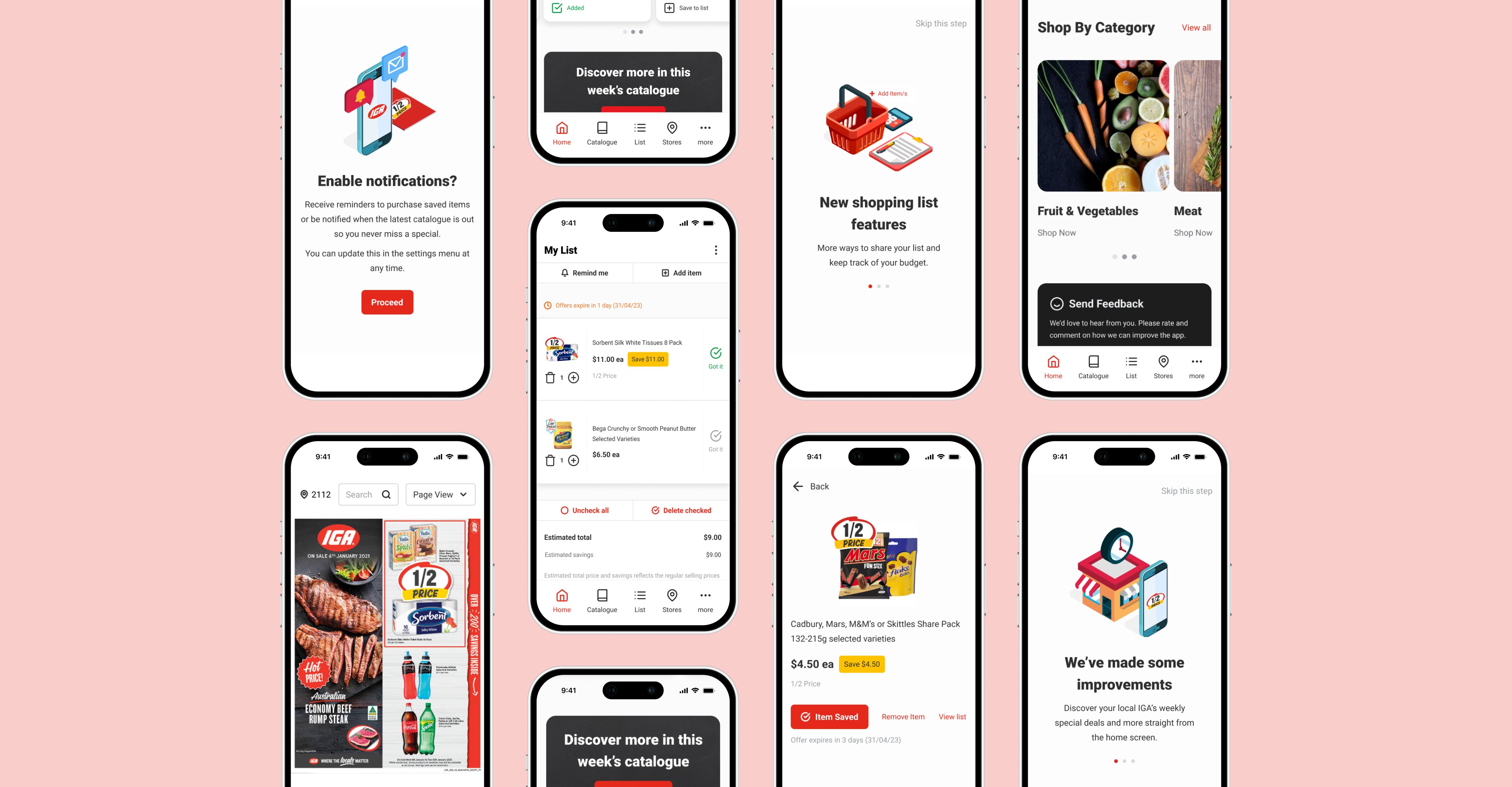
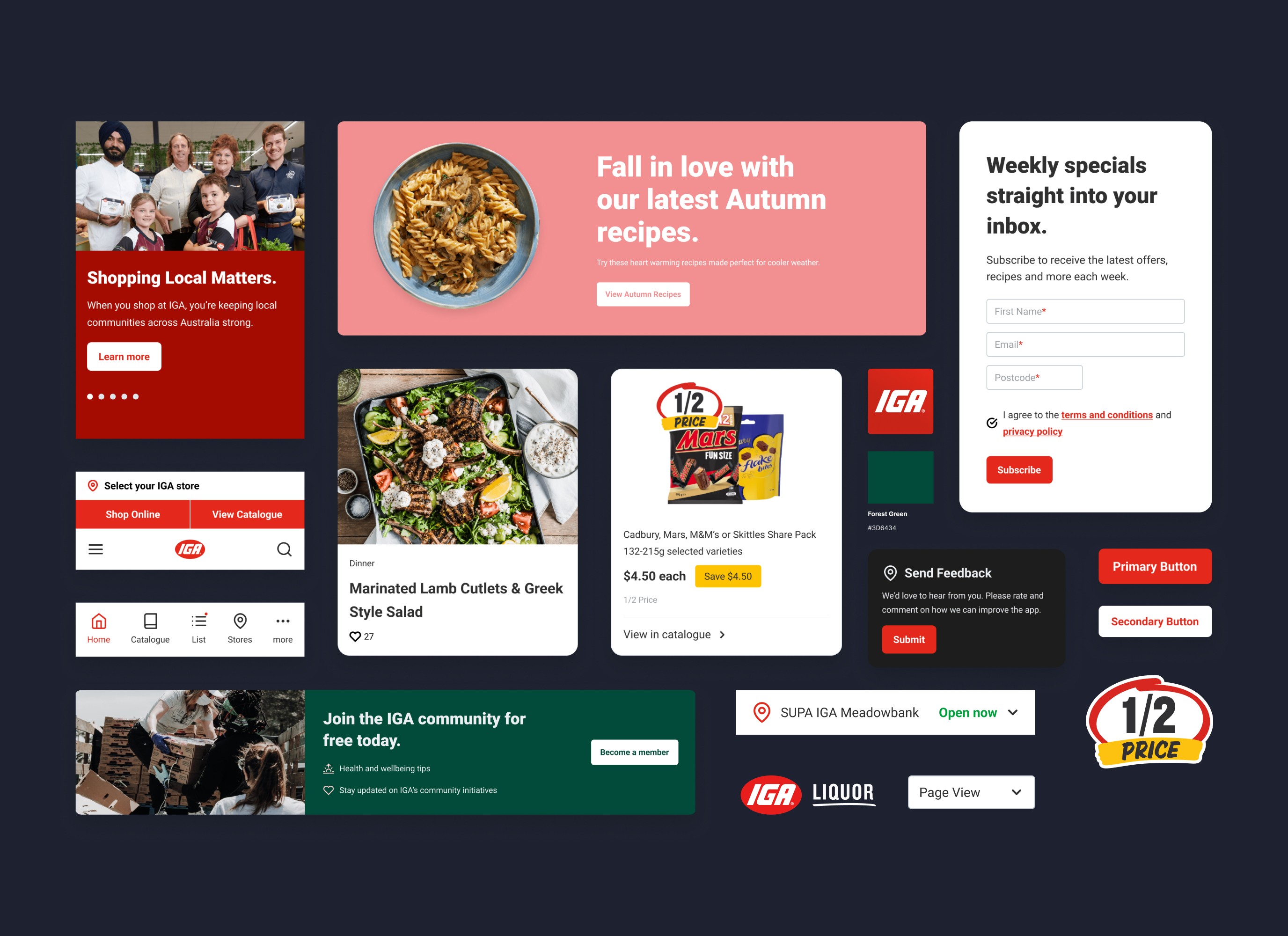
Using our design system, we designed new components as well as leveraging existing ones to create new variations. These variations include features that enhance shopper utility, such as the ability to add items to their list directly from the product cards, and setting push notifications to remind users to purchase their saved items or to notify them when specials are available.

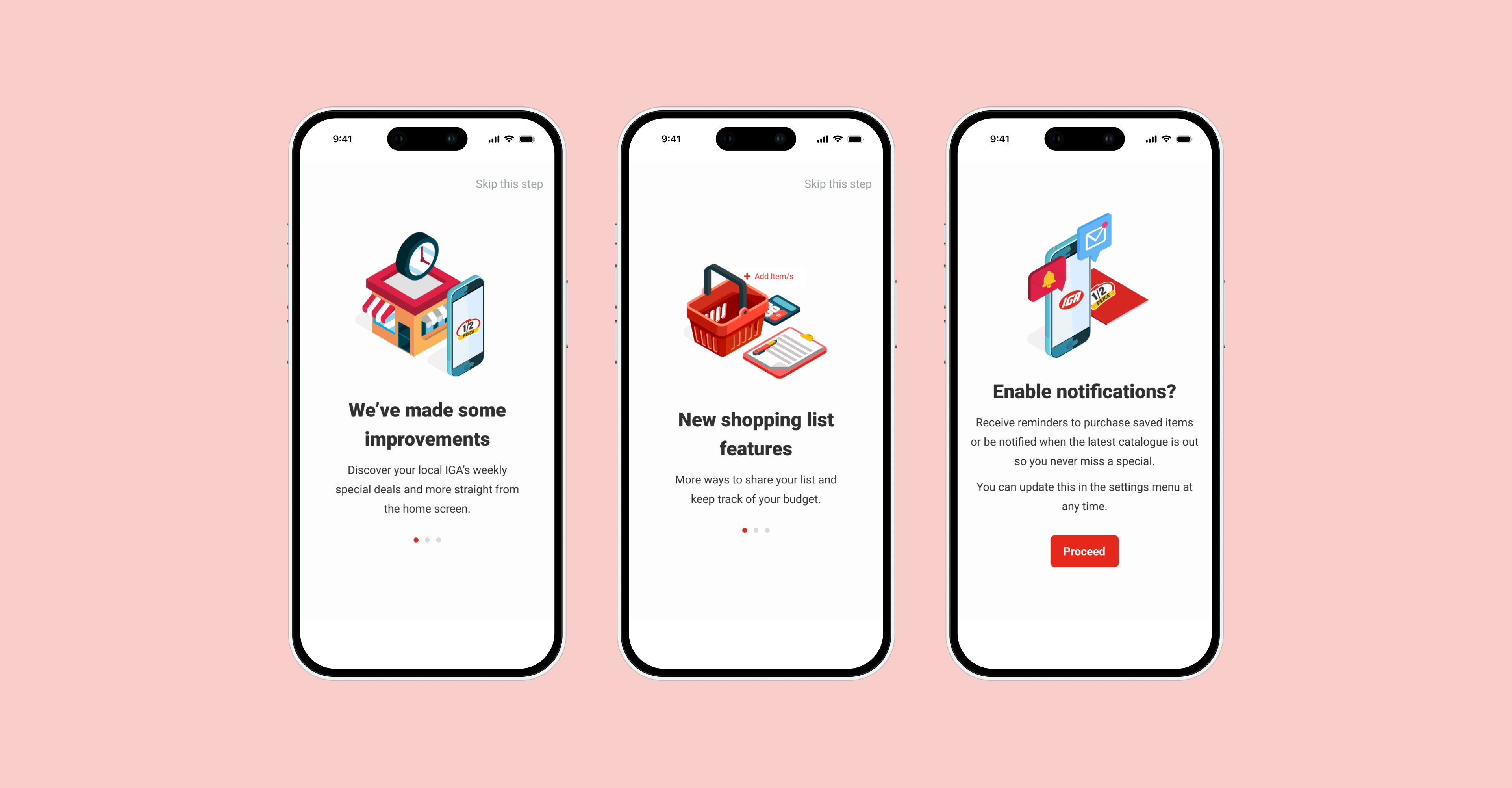
To ensure a smooth transition for both new and existing users to the updated design, we created onboarding screens. These screens inform users about the new and improved features and prompt them to enable notifications. Additionally, users are asked to select their preferred IGA store in order to display their relevant catalogue and weekly specials.

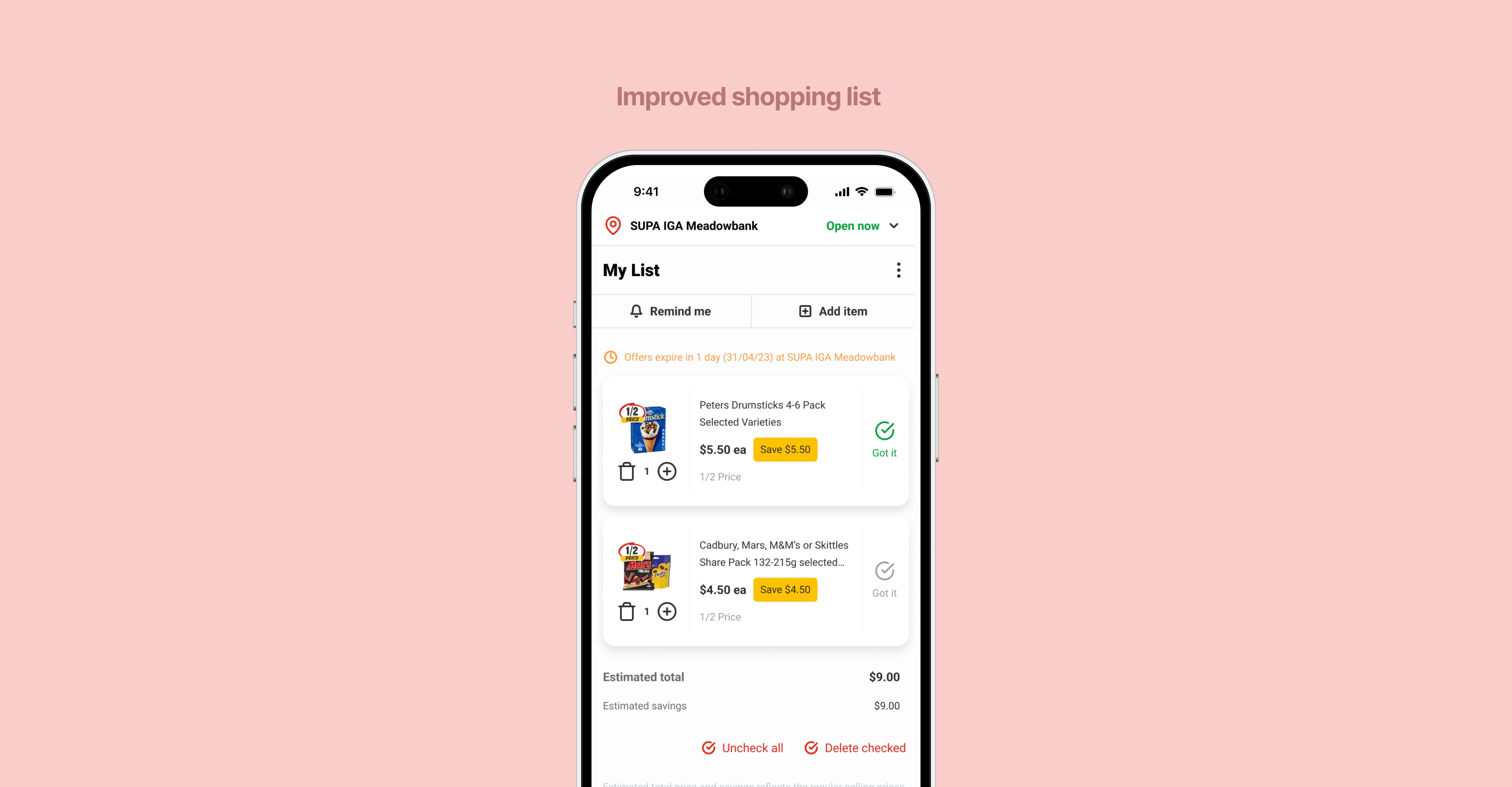
We also redesigned the shopping list experience to include features such as the ability to set reminders, the ability to tick off items, and displaying estimated total and savings to help shoppers better manage budget and spending expectations.

We also redesigned the shopping list experience to include features such as the ability to set reminders, the ability to tick off items, and displaying estimated total and savings to help shoppers better manage budget and spending expectations.

We also redesigned the shopping list experience to include features such as the ability to set reminders, the ability to tick off items, and displaying estimated total and savings to help shoppers better manage budget and spending expectations.

To create a consistent experience across our digital products, we integrated an existing feature from our website which provides shoppers a quick and easy way to view their local IGA stores information such as opening hours and address from the home screen.

Improved utility and discoverability on the home screen

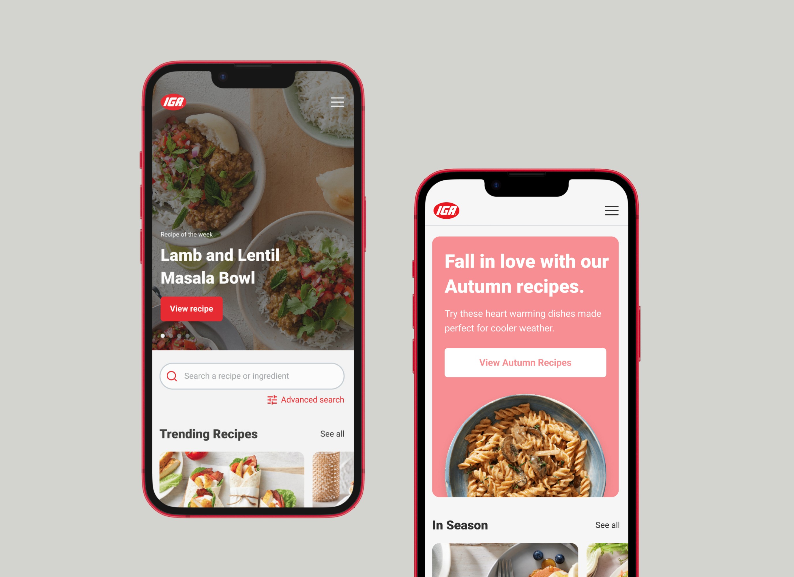
We made updates to the home screen to make it easier for shoppers to access important app features without having to navigate to inner screens. These features include viewing store details, discovering weekly specials and new products, shopping by category, and seeing what's in their shopping list.

Outcomes

With the IGA mobile app redesign delivered, we provided the business with a refreshed product as a foundation for continuing to work towards the larger goal of developing an e-commerce platform for IGA shoppers.

ā€¢ Established a roadmap for further product development

ā€¢ Provided metrics for measuring success

ā€¢ Positive reception from business and sign off to rollout

Outcomes

Improved utility and discoverability on the home screen

With the IGA mobile app redesign delivered, we provided the business with a refreshed product as a foundation for continuing to work towards the larger goal of developing an e-commerce platform for IGA shoppers.

ā€¢ Established a roadmap for further product development

ā€¢ Provided metrics for measuring success

ā€¢ Positive reception from business and sign off to rollout

We made updates to the home screen to make it easier for shoppers to access important app features without having to navigate to inner screens. These features include viewing store details, discovering weekly specials and new products, shopping by category, and seeing what's in their shopping list.

Unfortunately, shortly after the completion of the MVP, the digital marketing team was made redundant due to a company restructure and partially absorbed into the newly created e-commerce team. However, I left the business with a clear roadmap for product development, post-launch deliverables, and ways to measure success. These will facilitate the continued improvement of the IGA mobile app.
Contact me

Currently seeking a full-time UI/UX/Product Designer role šŸ™‚

Iā€™m looking for an opportunity to join an established team within a flexible working, design-mature organisation.

To create a consistent experience across our digital products, we integrated an existing feature from our website which provides shoppers a quick and easy way to view their local IGA stores information such as opening hours and address from the home screen.

Contact me

Currently seeking a full-time UI/UX/Product Designer role šŸ™‚

Iā€™m looking for an opportunity to join an established team within a flexible working, design-mature organisation.

Contact me

Currently seeking a full-time UI/UX/Product Designer role šŸ™‚

Iā€™m looking for an opportunity to join an established team within a flexible working, design-mature organisation.

Contact me

Currently seeking a full-time UI/UX/Product Designer role šŸ™‚

Iā€™m looking for an opportunity to join an established team within a flexible working, design-mature organisation.

Contact me

Currently seeking a full-time UI/UX/Product Designer role šŸ™‚

Iā€™m looking for an opportunity to join an established team within a flexible working, design-mature organisation.